HROTE – Hrvatski operator tržišta energije
From symbol to system.
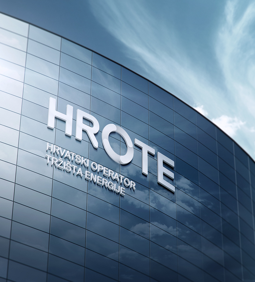
With the ambition for HROTE (the Croatian Energy Market Operator) to position itself among the leading service providers in the Central European energy market—and to further integrate the Croatian energy market into the wider EU framework—a need arose for rebranding and the development of a new visual communication system.
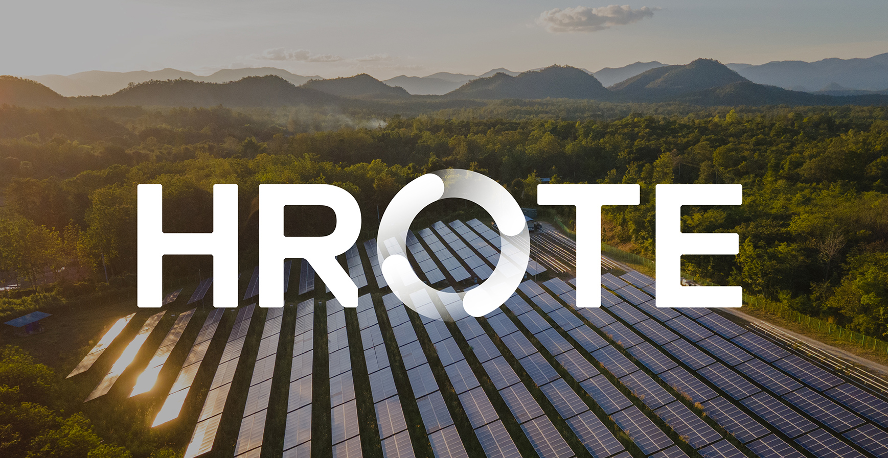
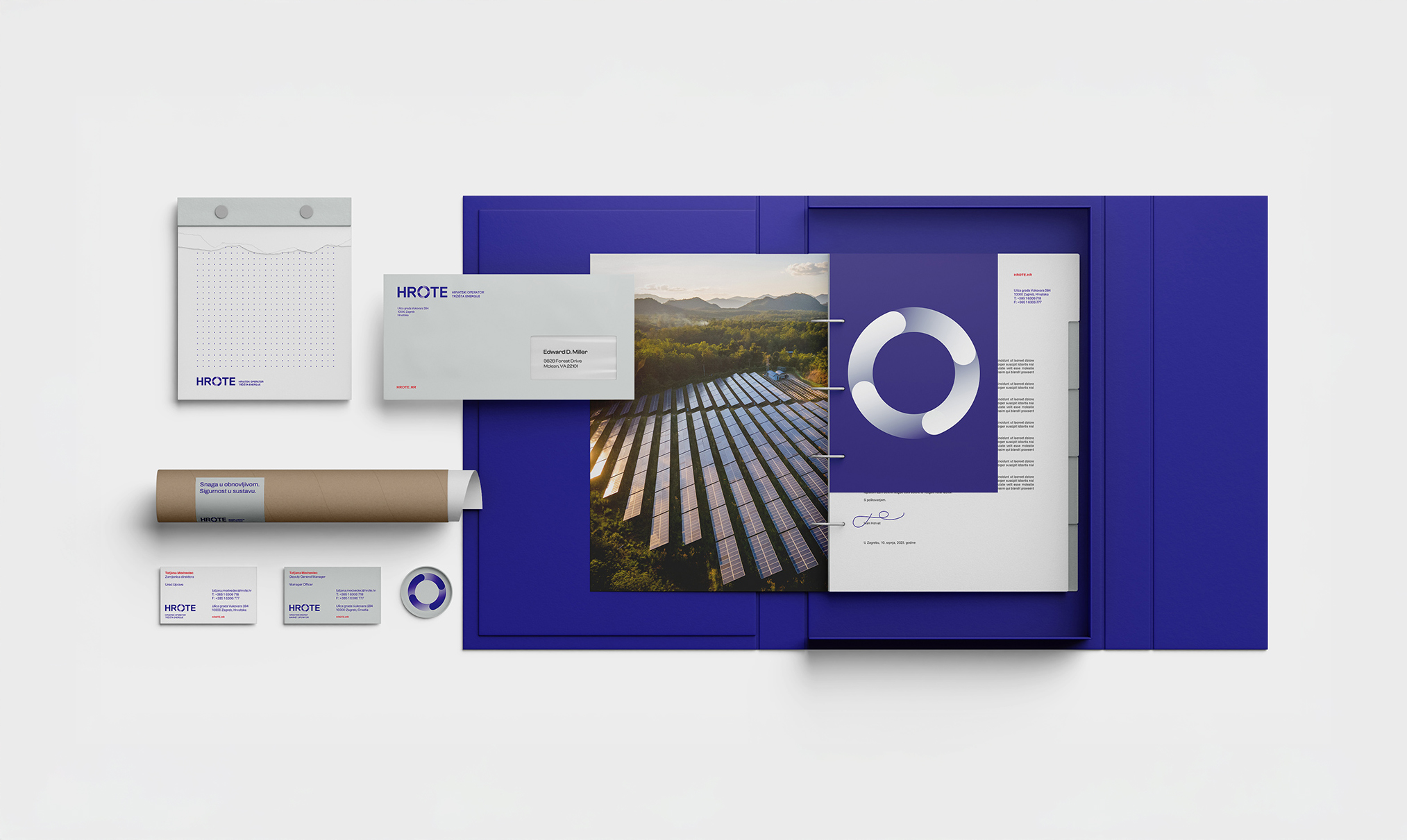
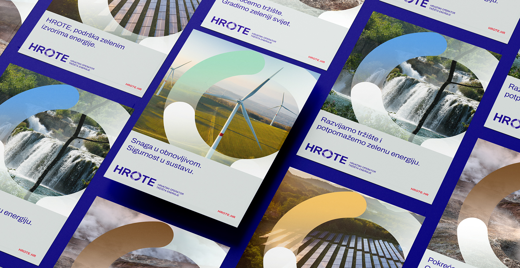
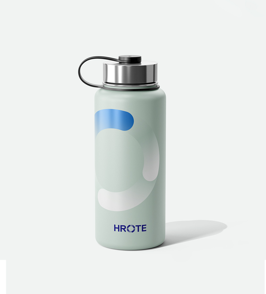
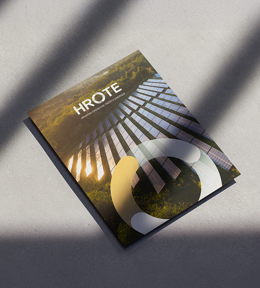
The result is a system built around a central circular symbol, composed of four equal segments that evoke the natural cycle of elements. Each segment represents one of the energy sources that surround us: sun, water, wind, and soil. Each is assigned a distinct colour, carried consistently throughout the visual identity.
The new identity marks a shift toward a contemporary visual language, reflecting the company’s commitment to innovation on both the local and global energy stage. Across the various materials through which the company presents itself, particular emphasis is placed on animated elements—designed to highlight and encourage the production of electricity from renewable sources and cogeneration.
Client
HROTE - Hrvatski operator tržišta energije
Category
Rebranding
Services
Visual identity
Credits
Siniša Sudar (Creative Director)
Ida Sinovčić (Art Director)
Ida Tortić (Graphic and Motion Designer)
Petar Mudnić-Cerineo (Senior Graphic Designer)
Bruna Čičin-Šain (Junior Graphic Designer)
Eva Bakrač (Junior Motion Designer)
Tibor Jeličić Szorsen (Account Manager)
Next project
Boutique Hotel Venturo