
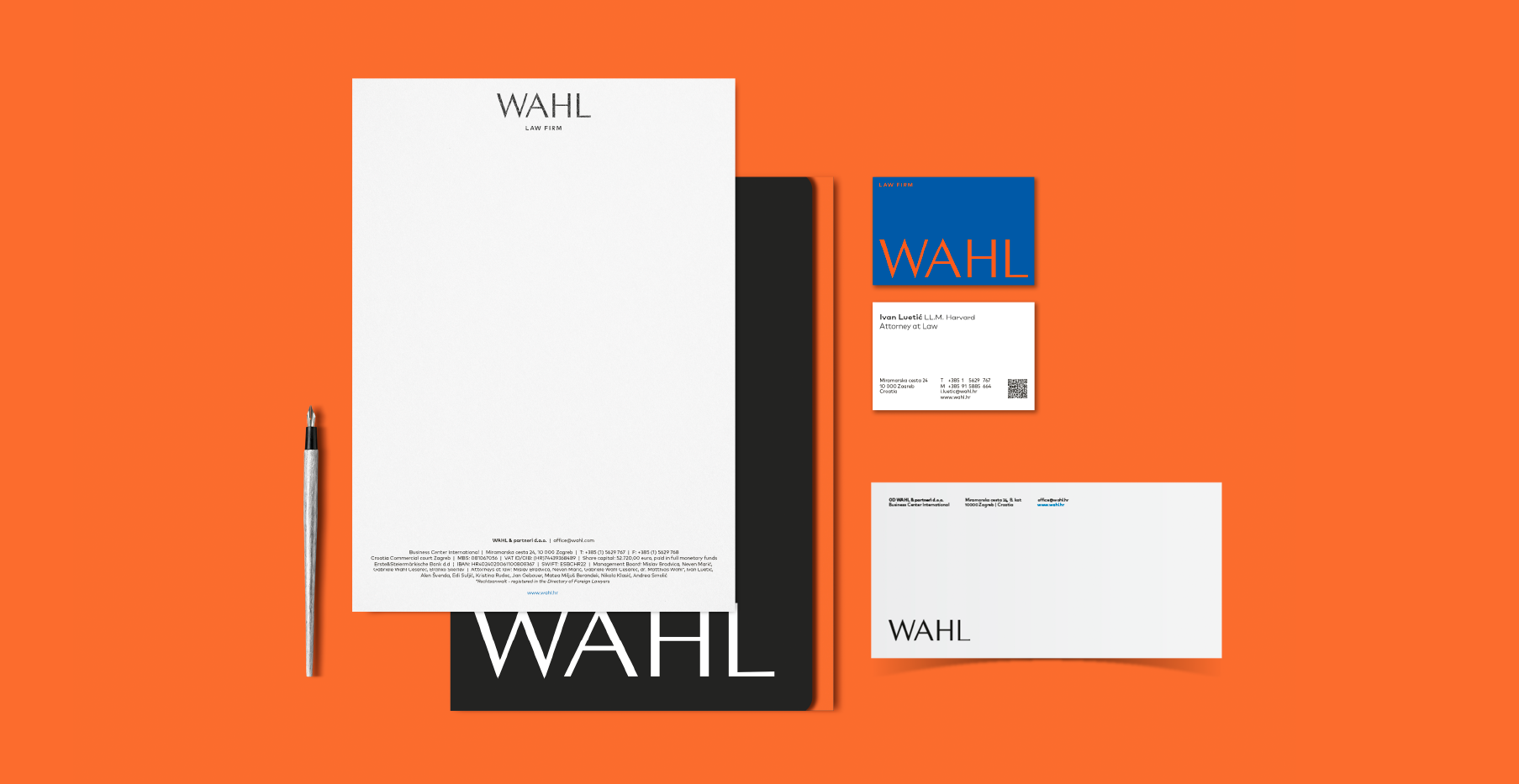
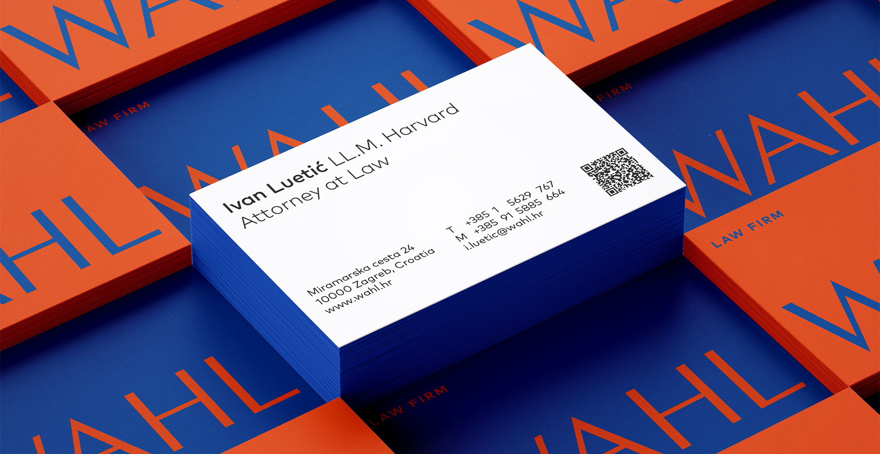
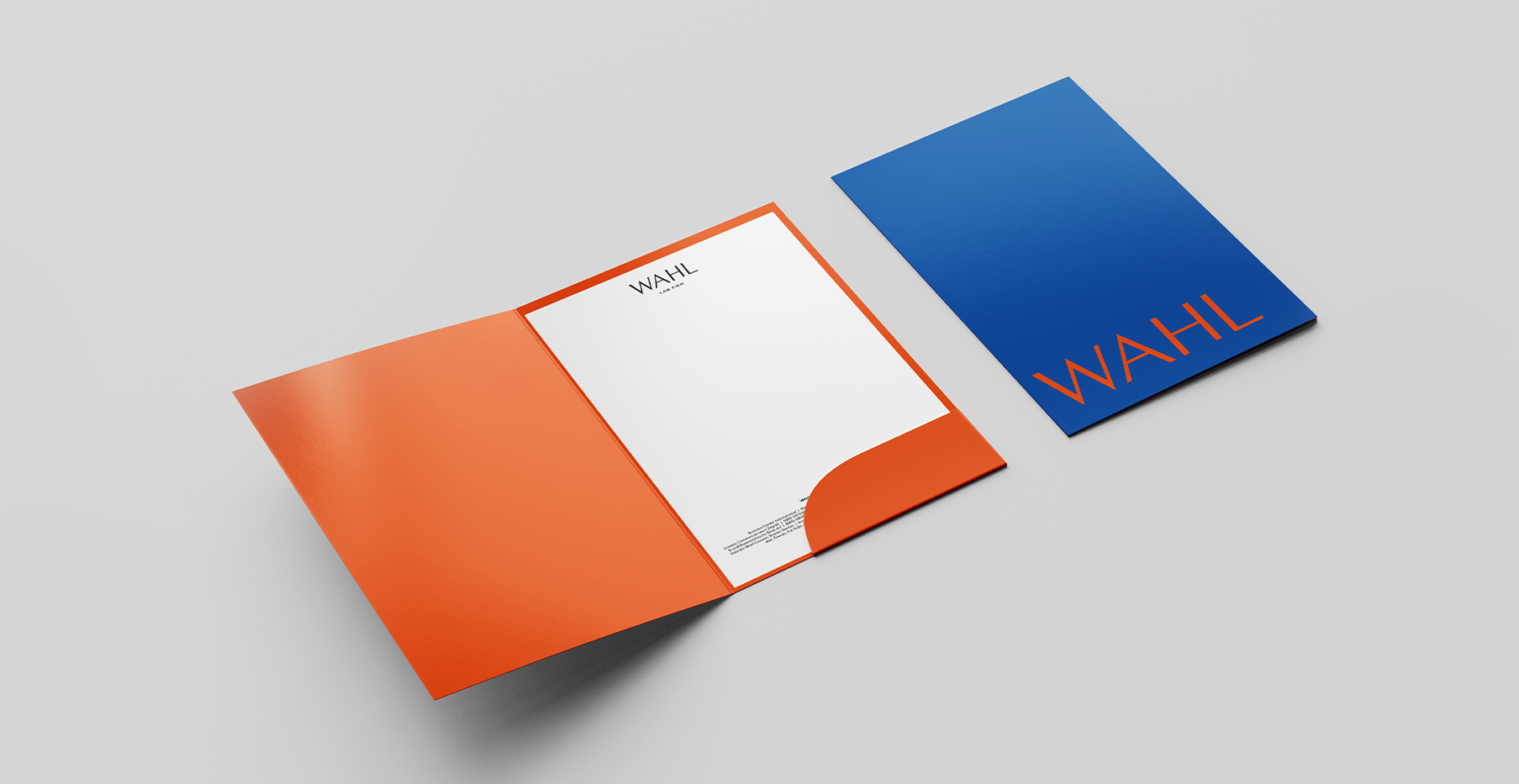
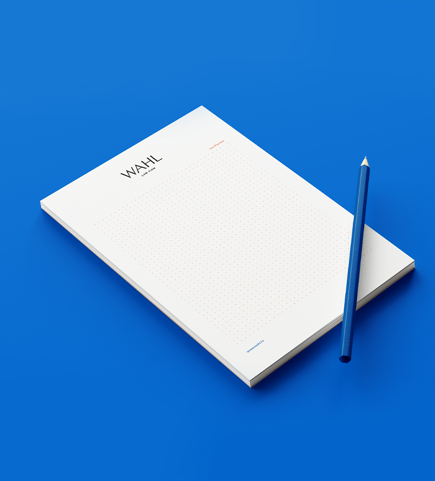
WAHL Law Firm
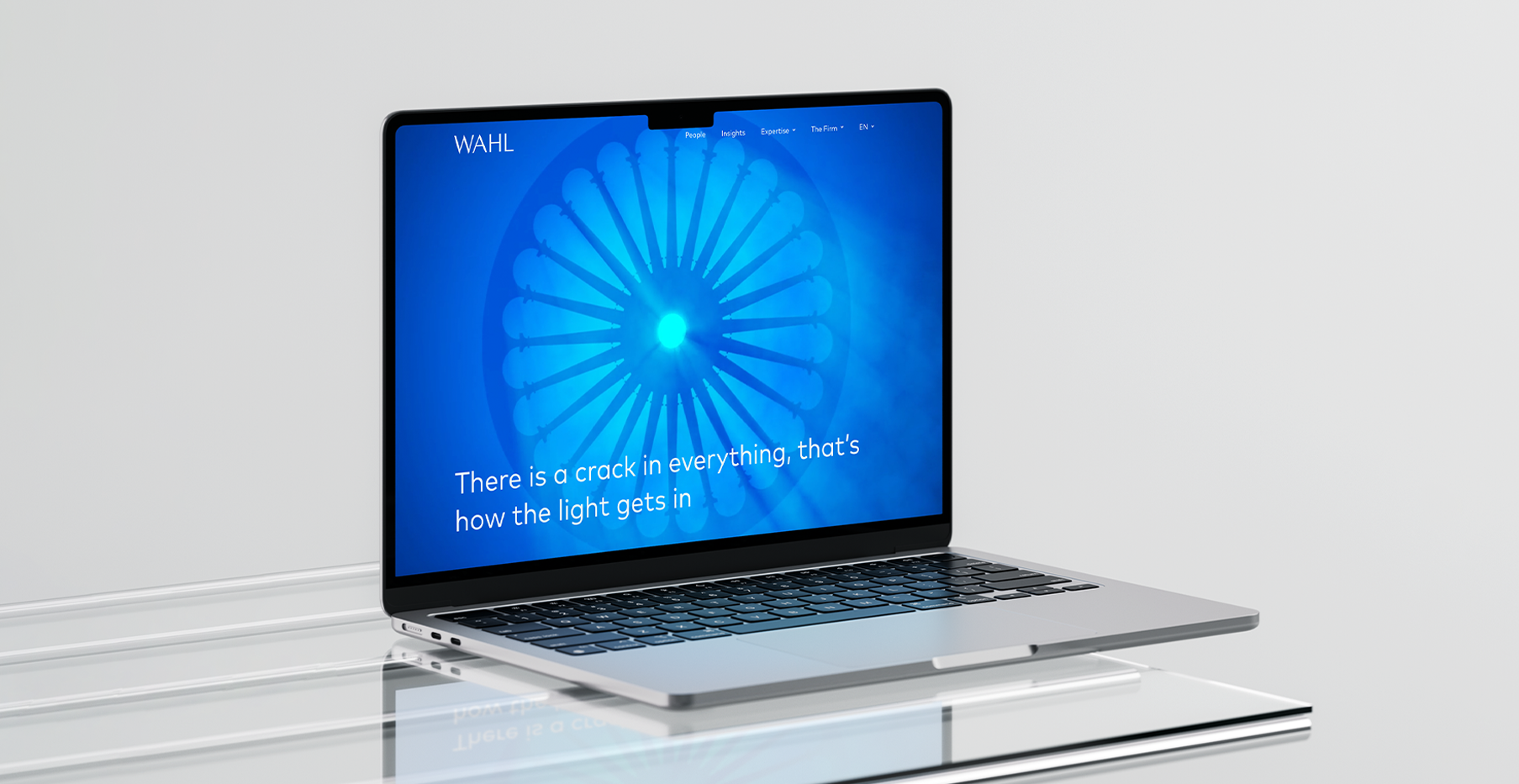
Every transformation begins with a shift. For WAHL, formerly known as BMWC, it was a moment of evolution — a move toward greater clarity and distinction. Guided by the quote from "Anthem" by Leonard Cohen "There is a crack, a crack in everything. That's how the light gets in." WAHL’s rebrand became an exploration of contrast: the balance between precision and warmth, structure and openness.
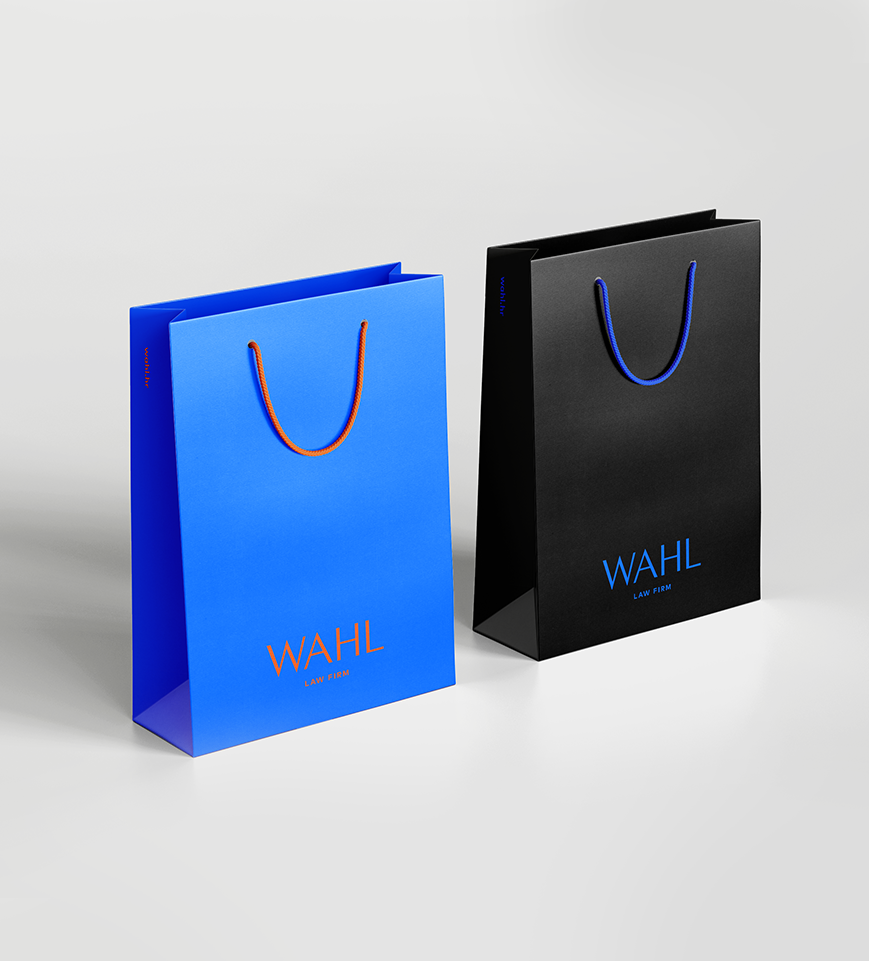
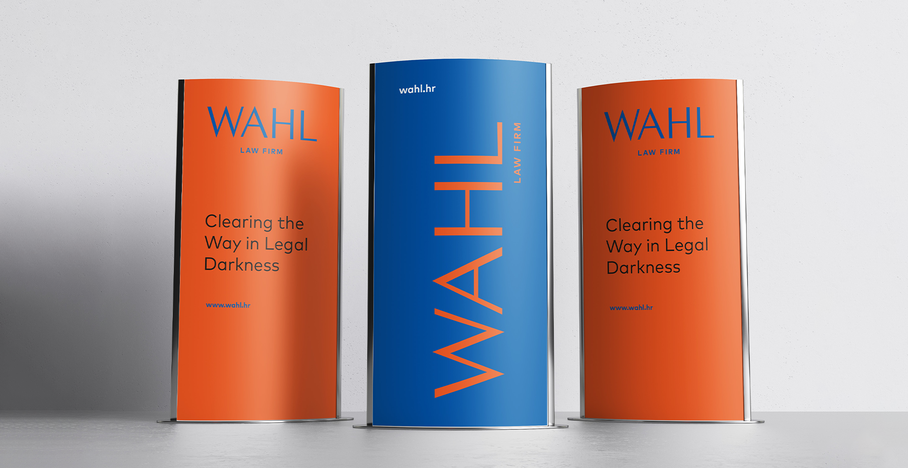
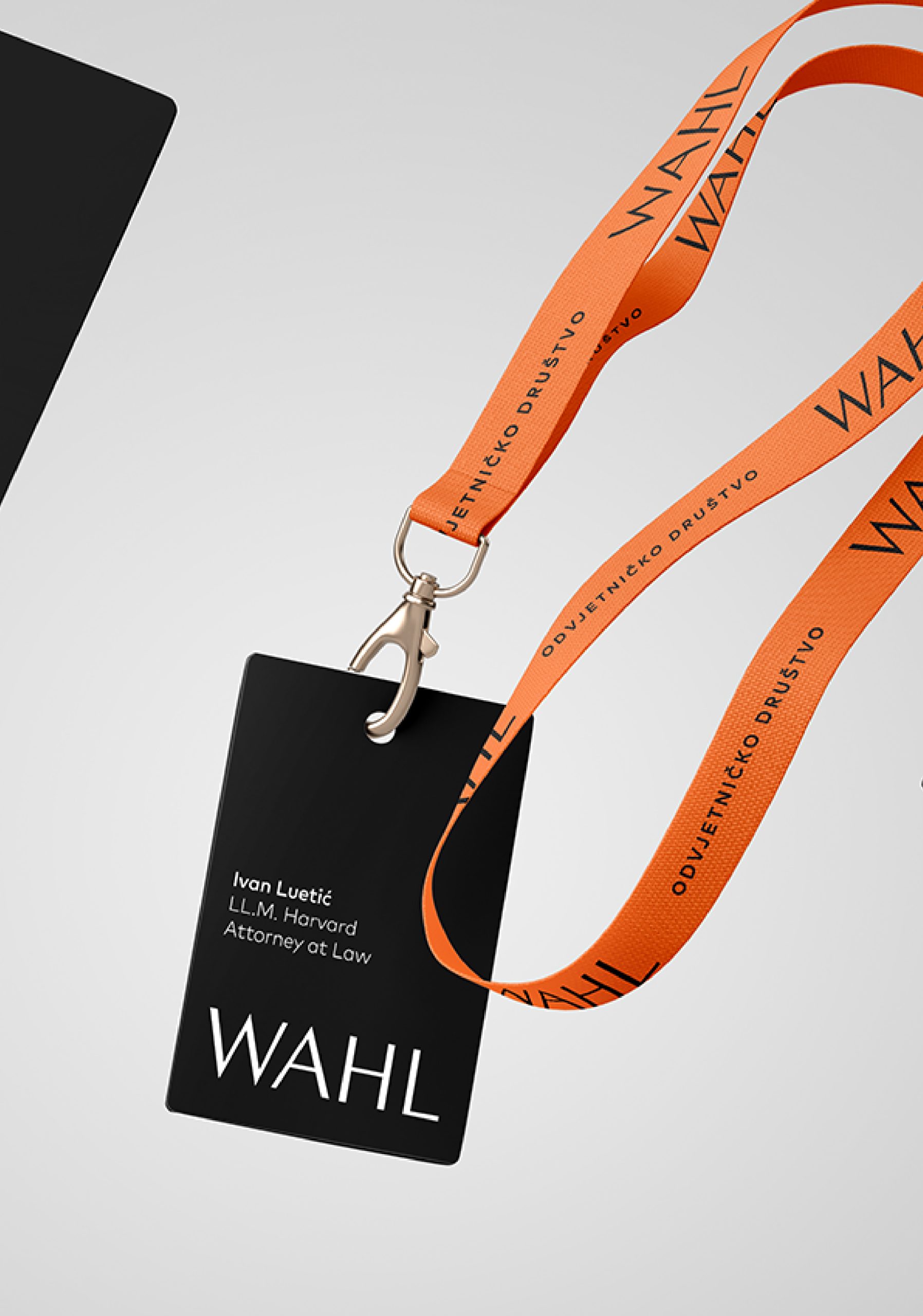
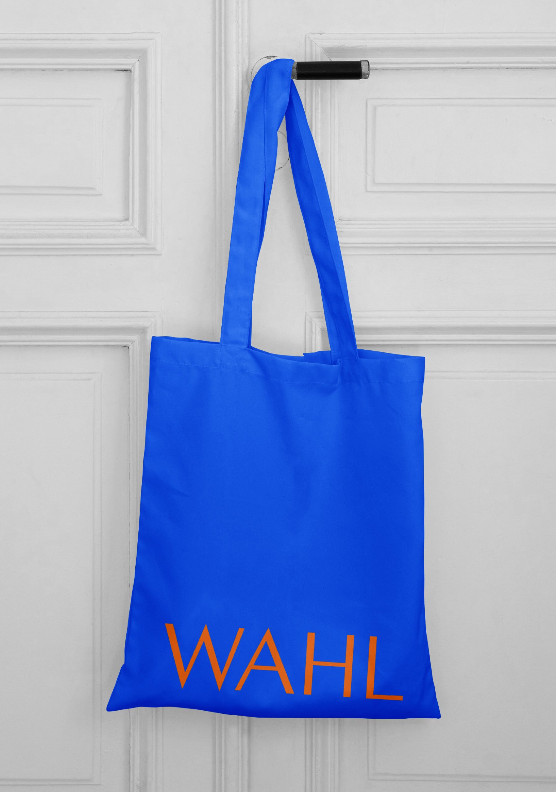
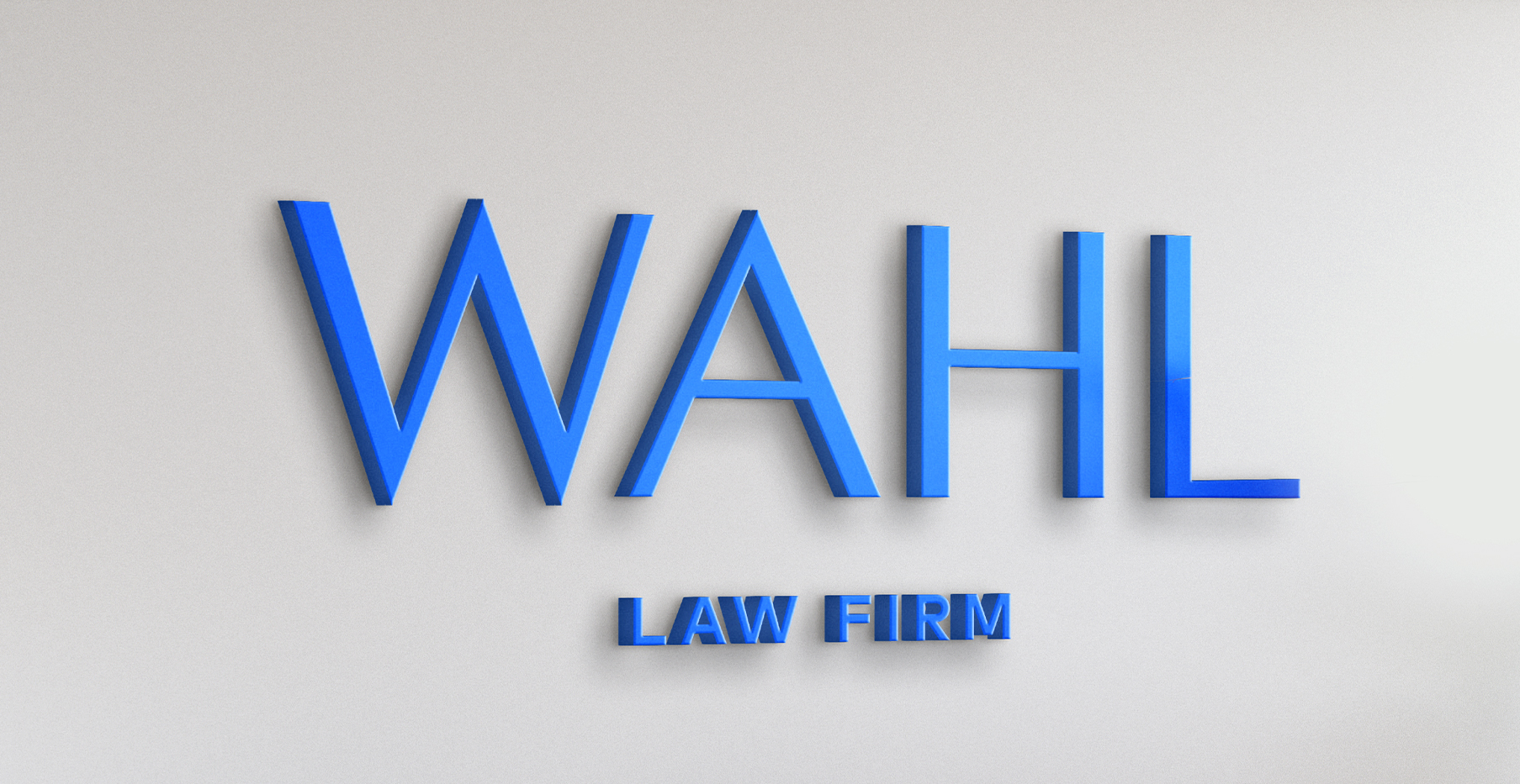
The new visual identity translates this philosophy into form. Firm, architectural lines in the logotype convey authority and trust, while subtle gestures introduce a sense of humanity. A bold color palette breaks away from the muted tones typical of the legal world, establishing a visual language that is both refined and fearless. WAHL’s new identity is more than a change of name — it’s a redefinition of presence. A reflection of their guiding truth: that even in the most structured spaces, light finds its way through the cracks.
Client
WAHL Law Firm
Category
Branding
Services
Visual identity / Web design
Credits
Siniša Sudar (Creative Director)
Ida Sinovčić (Art Director)
Ida Tortić (Graphic and Motion Designer)
Bruna Čičin-Šain (Graphic Designer)
Roberta Cindrić (UI Designer)
Kristina Majer (Junior Graphic Designer)
Tibor Jeličić Szorsen (Account Manager)
Luka Radanović (Web Development)

Next project
Phonak – Invisible Hearing Campaign