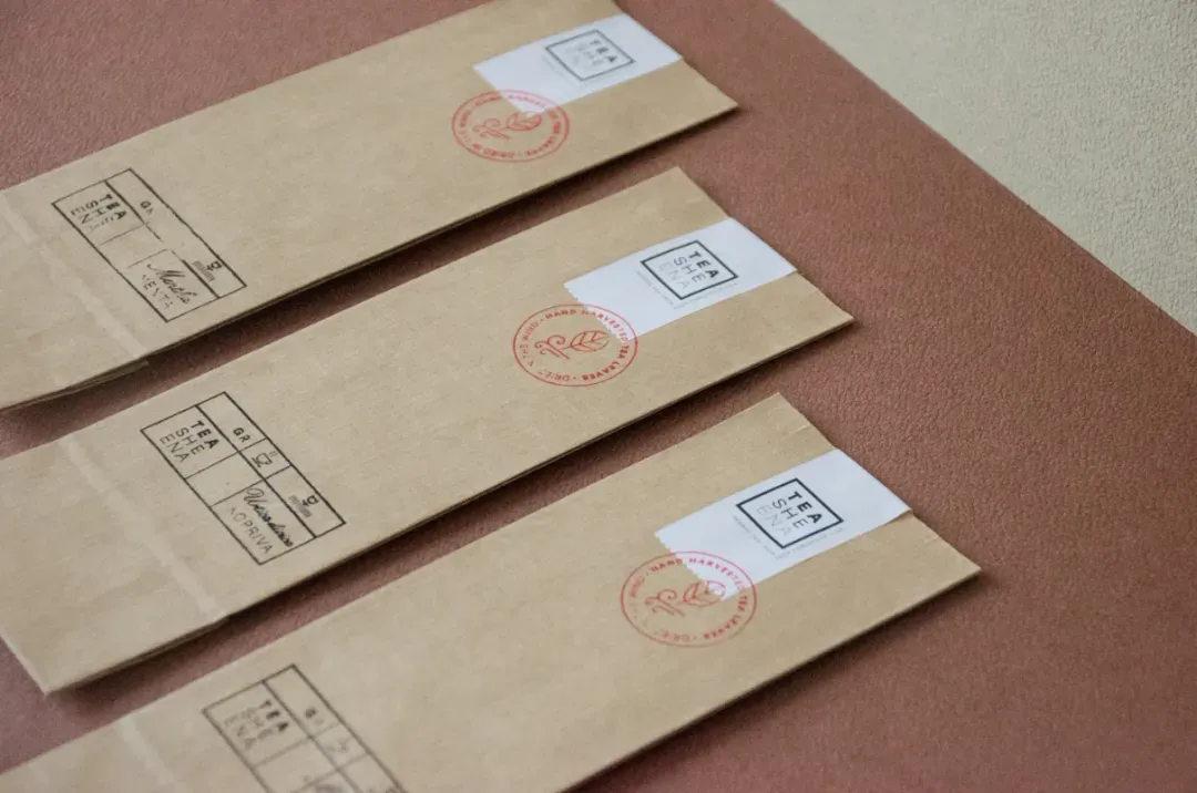
Teasheena
Tišina, pronounced tea-she-ena, is the Croatian word for “silence." It can also mean stillness, quiet, zen, things of that nature. This lovely tea is hand-harvested in the woods of Lika, a region famous for its many varieties. Our brand identity makes use of a logotype of varying weight to convey the idea of stillness, coupled with minimal use of color.
Client
Eko OPG Ljubica Sabljak
Category
Food and Beverage
Services
Visual identity, packaging
Credits
Siniša Sudar (Creative Director)
Žana Mrša (Art Director)


Next project
Notch
