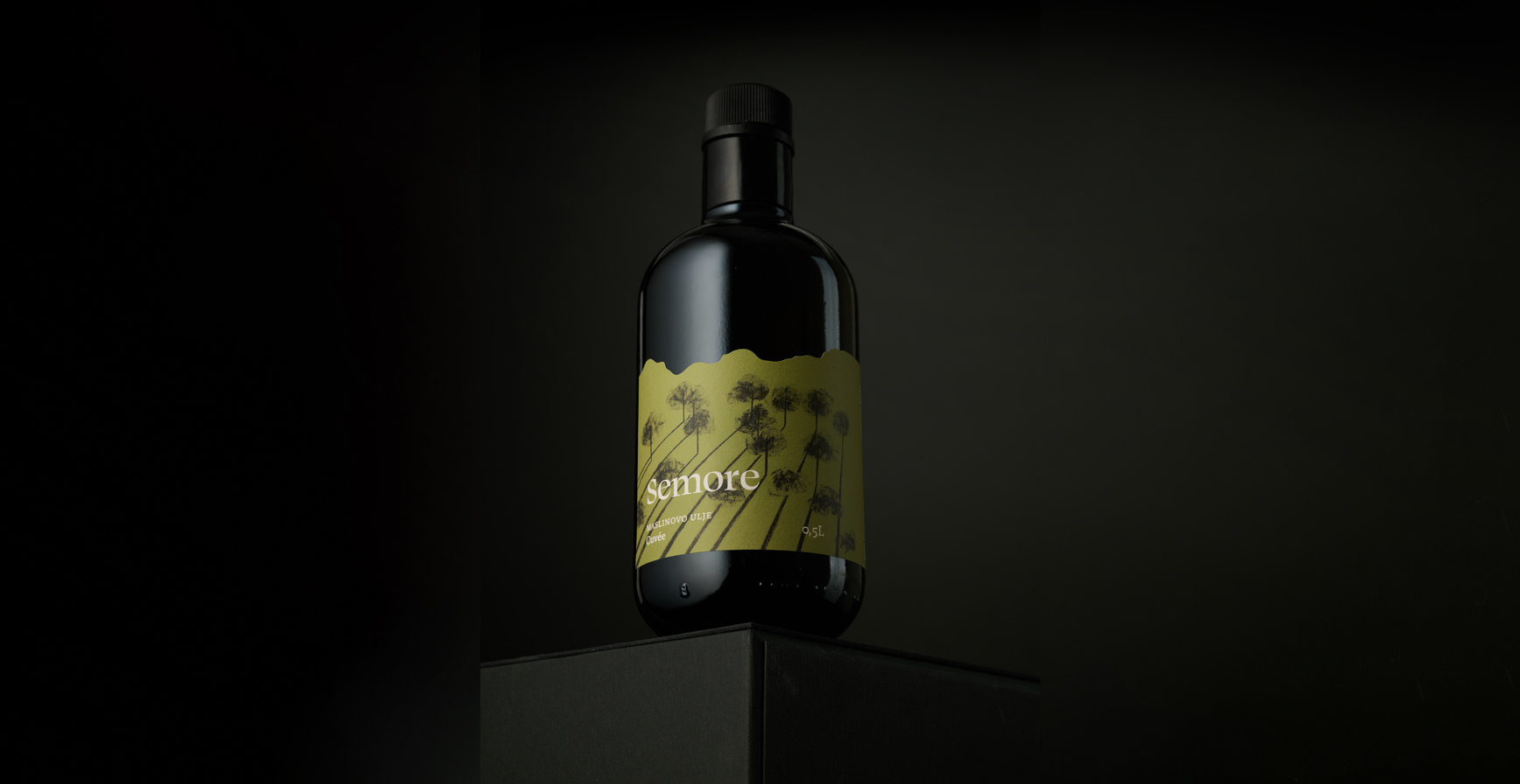
Semore Olive Oil
"Se more" is an Istrian-derived expression from "Može se" and represents the olive oil brand of the Poropat family, known for its premium Istrian oils. This line of oils is a hommage to olive cultivation and a celebration of the growing, nurturing, and essence of olives. The label for Semore oil is illustrated as a romantic scene from an olive grove, where sunbeams gently penetrate through the branches, creating a dynamic play of shadows that shapes the composition. This visual representation uses a palette of olive green and black colors, harmoniously combined with the white Semore logo, clearly communicating the brand's identity.
Client
Private person
Category
Label design
Services
Visual identity, packaging
Credits
Siniša Sudar (Creative Director)
Erik Burić (Graphic Designer, Illustrator)
Next project


