JGL promotional materials
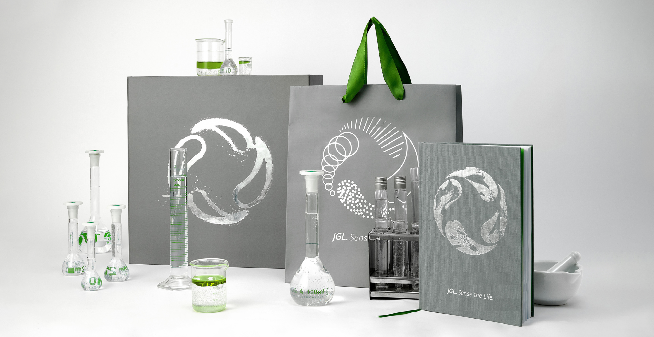
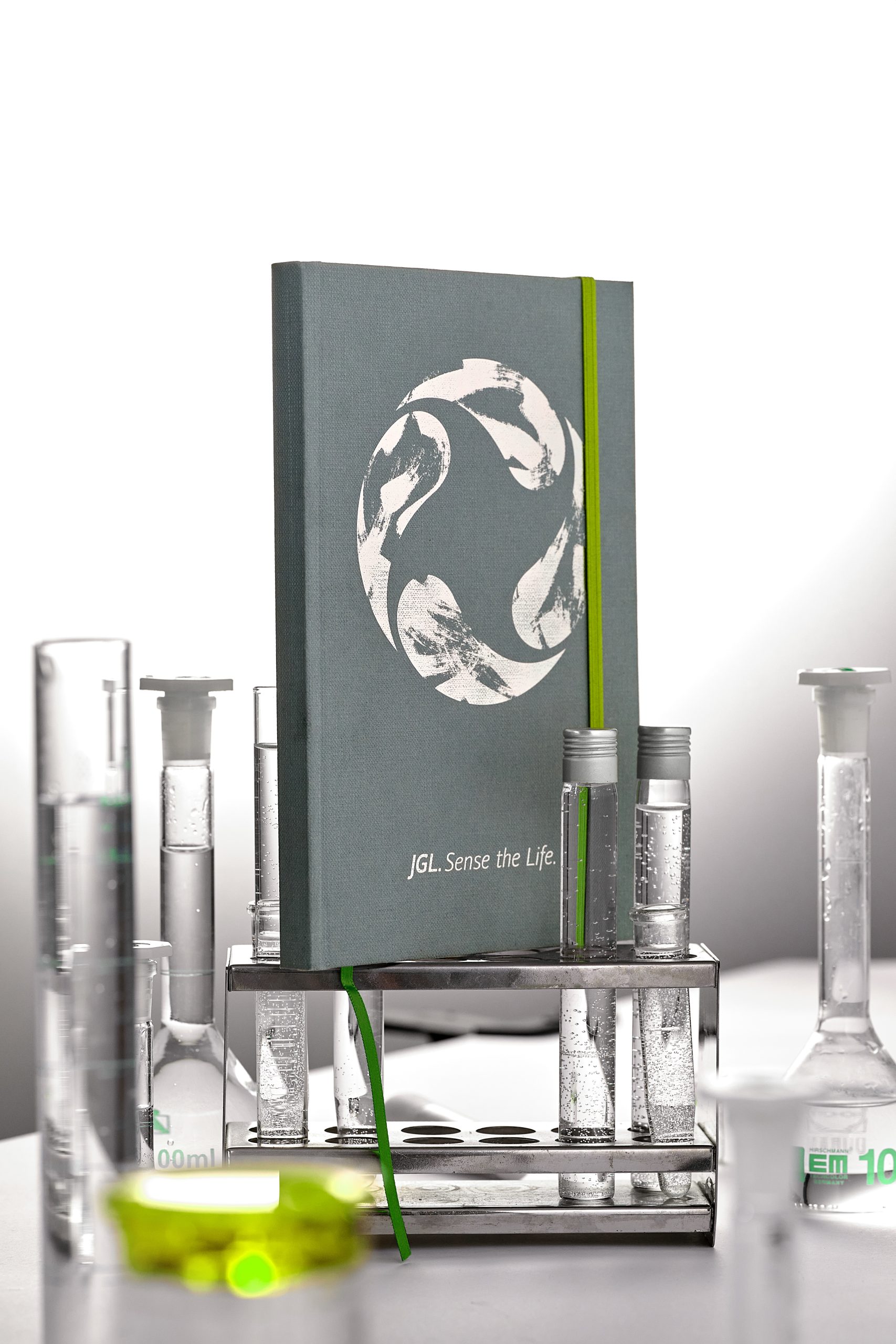
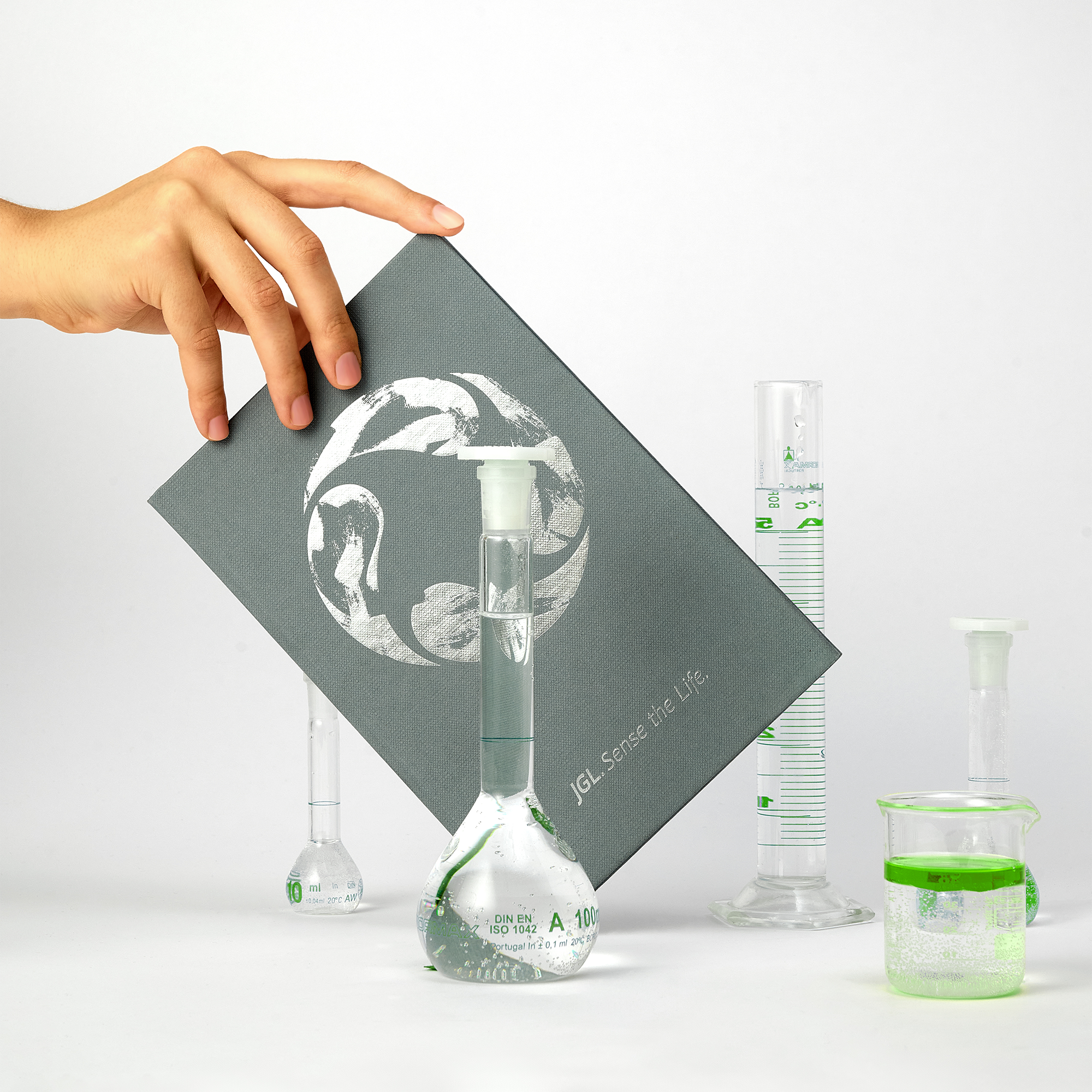
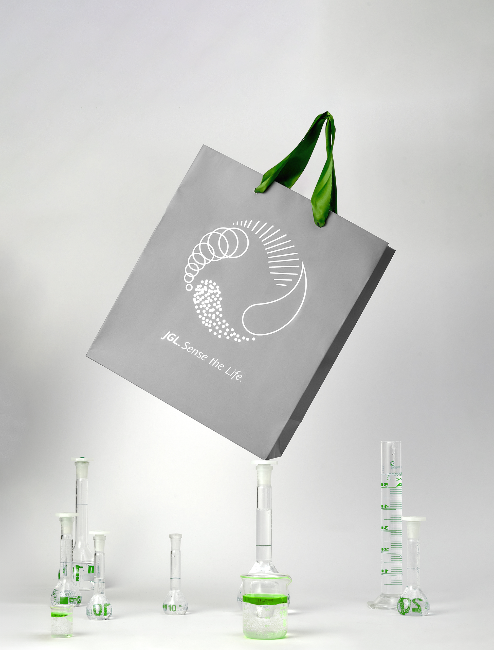
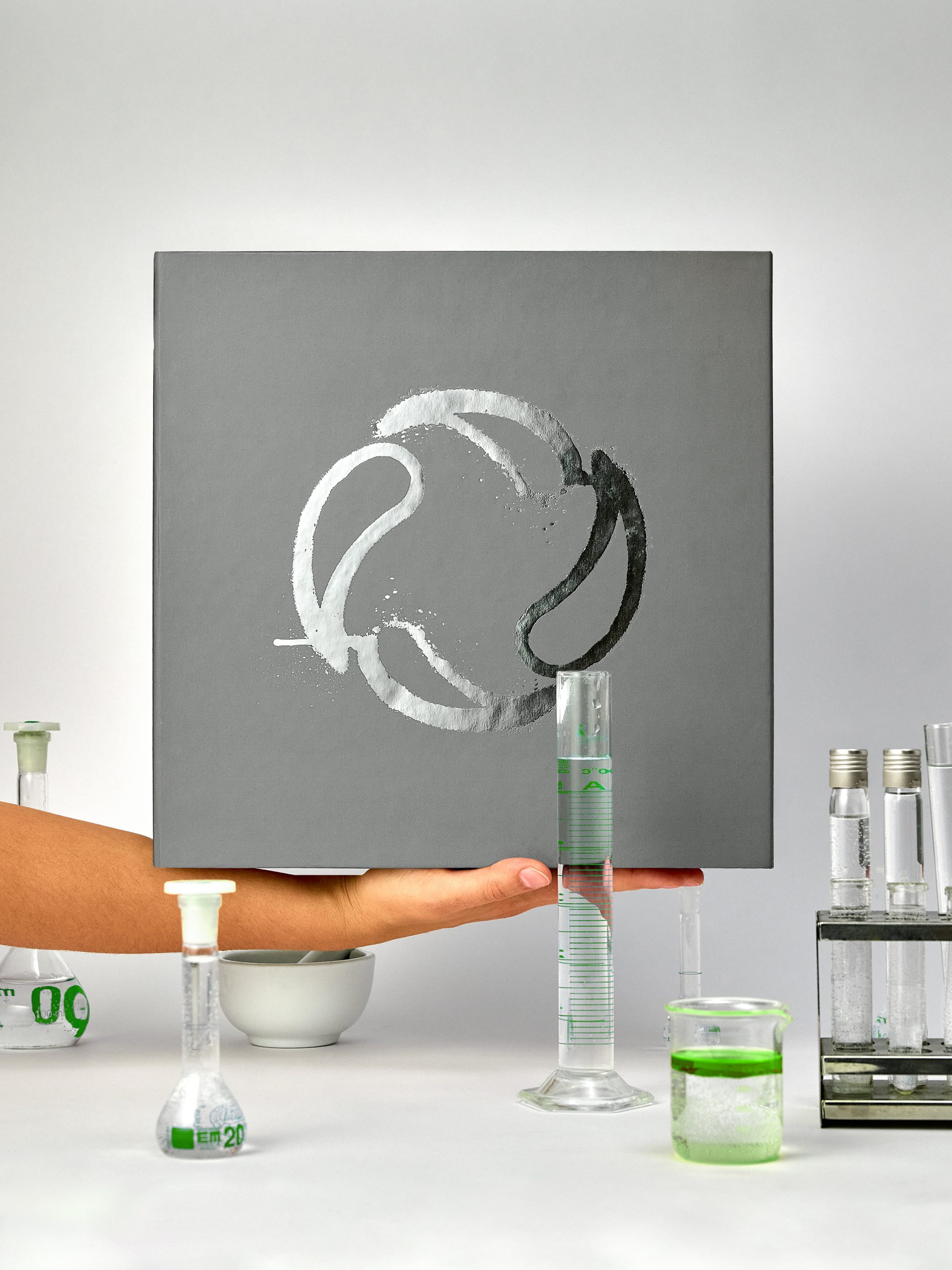
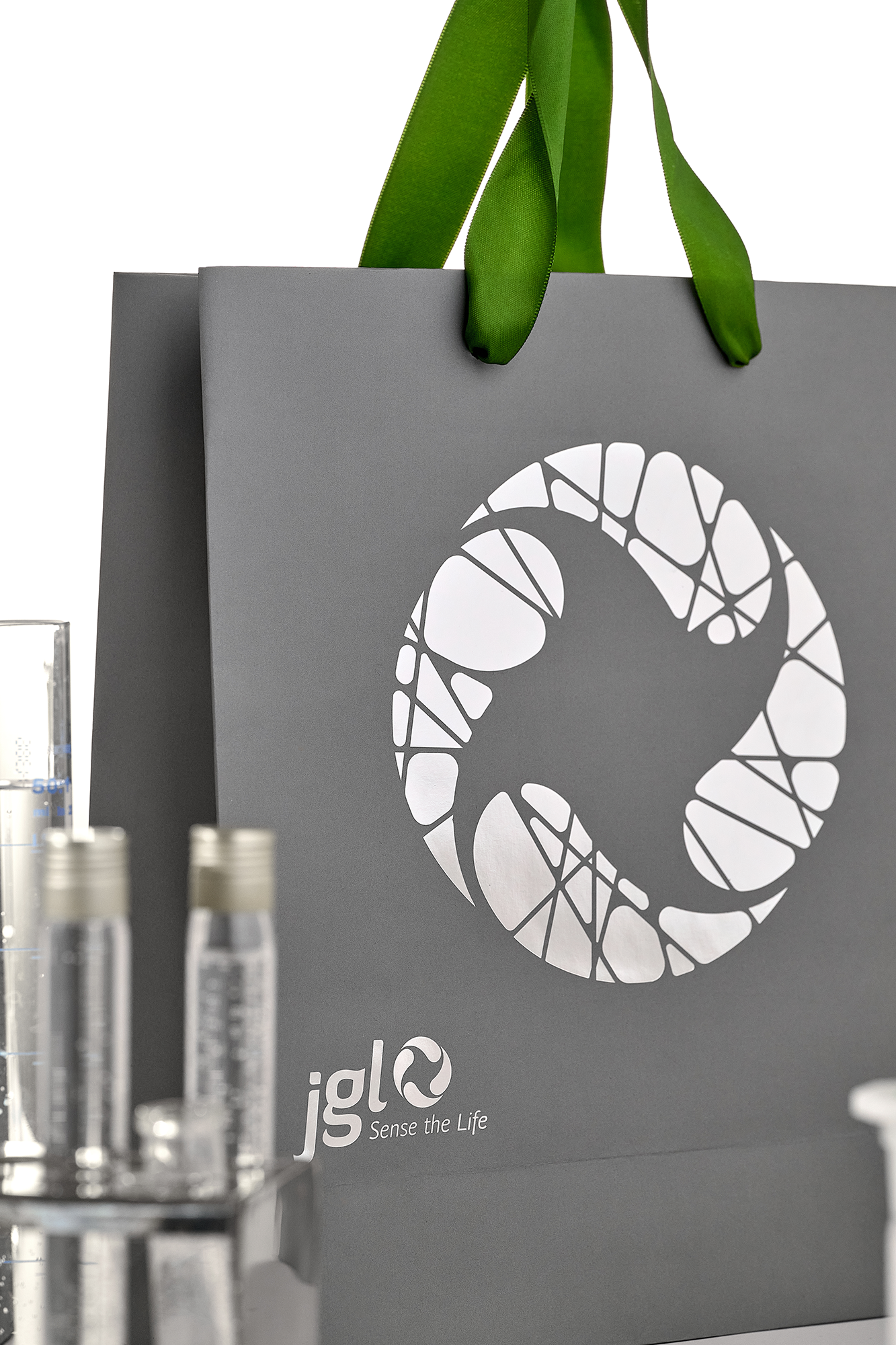
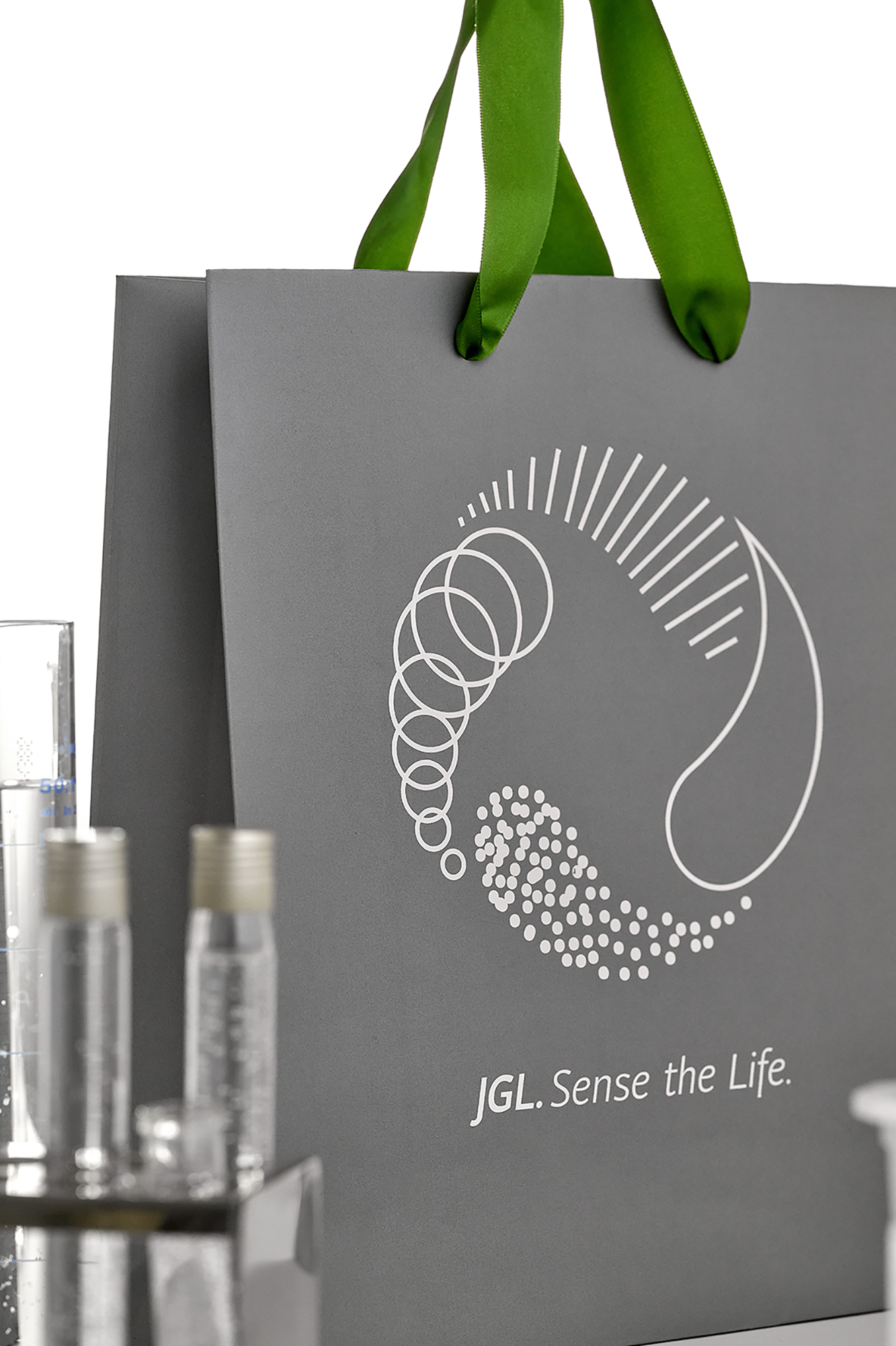
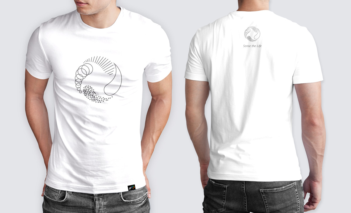
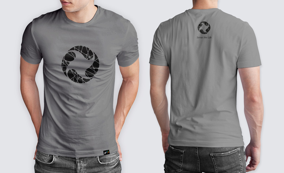
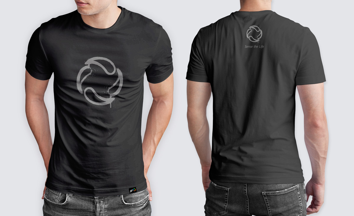
The initial project brief was to design T-shirts that would move away from the existing corporate look and lean more toward a casual aesthetic. The recognisable JGL symbol, composed of four droplets arranged in a circular form, was reinterpreted and presented through various graphic styles. This diversity reflects the company’s then-new slogan, “Sense the Life,” and allows the wearer to express a part of their personality. A monochromatic print on black, white, or dark gray T-shirts feels subtle and refined, offering a contrast to standard corporate apparel dominated by rich colors. User feedback was very positive, which led to the decision to apply these graphic visuals across other promotional materials that same year.
Client
JGL
Category
Promotional materials
Services
Branding / Packaging
Credits
Siniša Sudar (Creative Director)
Ida Sinovčić (Art Director, Graphic Designer)
Tibor Jeličić Szorsen (Account Manager)
Bojan Matoš (Photography)
Dariva (Packaging production)
IT Graf (Print and binding production)
Next project
Tuškanac Park Residences
