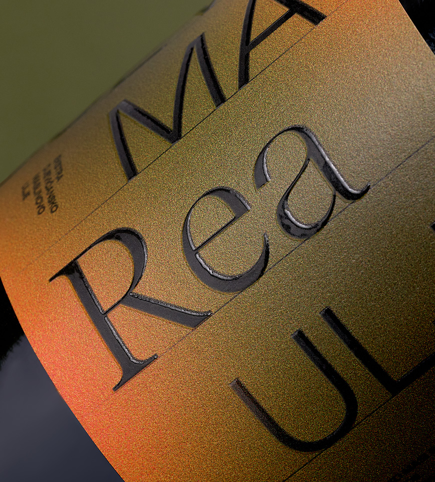
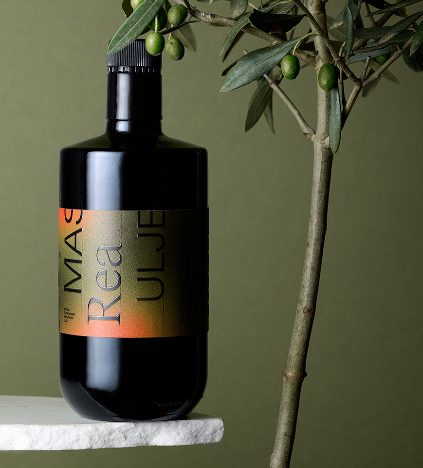
Rea Olive Oil
Bathed in the light of the Adriatic, Rea olive oil is rooted in the largest olive grove on the sun-drenched island of Vis. Its visual identity draws from the geometry of the modernist house that rises above the grove — a place where architecture and landscape exist in quiet harmony. The label translates this connection through bold, shifting typography that fractures and reassembles like sunlight across stone. It captures the rhythm of the island itself — structured yet organic, precise yet full of life — celebrating the enduring dialogue between craft, nature, and design.
Client
Rea Olive Oil
Category
Packaging
Services
Label design
Credits
Siniša Sudar (Creative Director)
Žana Mrša (Art Director)
Bojan Matoš (Photography)
Eva Bakrač (Junior Motion Designer)
Lucija Škevin (3D Designer)
Next project
WAHL Law Firm